Owl 组件
Odoo JavaScript 框架使用了一个名为 Owl 的自定义组件框架。它是一个声明式组件系统,灵感部分来源于 Vue 和 React。组件通过 QWeb 模板 定义,并辅以一些特定于 Owl 的指令。官方 Owl 文档 包含了完整的参考和教程。
重要
尽管代码可以在 web 模块中找到,但它是由一个独立的 GitHub 仓库维护的。因此,对 Owl 的任何修改都应通过 https://github.com/odoo/owl 上的拉取请求进行。
注解
目前,所有 Odoo 版本(从版本 14 开始)共享相同的 Owl 版本。
使用 Owl 组件
Owl 文档 已经详细记录了 Owl 框架,因此本页面仅提供与 Odoo 相关的信息。但首先,让我们看看如何在 Odoo 中创建一个简单的组件。
import { Component, xml, useState } from "@odoo/owl";

class MyComponent extends Component {
    static template = xml`
        <div t-on-click="increment">
            <t t-esc="state.value">
        </div>
    `;

    setup() {
        this.state = useState({ value: 1 });
    }

    increment() {
        this.state.value++;
    }
}
此示例表明,Owl 在全局命名空间中作为库存在,名称为 owl :它可以像大多数 Odoo 库一样简单地使用。请注意,这里我们将模板定义为静态属性,但未使用 static 关键字,因为某些浏览器不支持该关键字(Odoo JavaScript 代码应符合 Ecmascript 2019 标准)。
我们在这里借助 xml 辅助工具,在 JavaScript 代码中定义模板。然而,这仅适用于入门。在实际开发中,Odoo 中的模板应定义在 XML 文件中,以便能够翻译。在这种情况下,组件只需定义模板名称即可。
在实际开发中,大多数组件应定义 2 或 3 个文件,这些文件位于同一位置:一个 JavaScript 文件 (my_component.js)、一个模板文件 (my_component.xml),以及可选的 SCSS(或 CSS)文件 (my_component.scss)。然后,这些文件应被添加到某个资源包中。Web 框架将负责加载 JavaScript/CSS 文件,并将模板加载到 Owl 中。
以下是上述组件的定义方式:
import { Component, useState } from "@odoo/owl";

class MyComponent extends Component {
    static template = 'myaddon.MyComponent';

    ...
}
模板现在位于相应的 XML 文件中:
<?xml version="1.0" encoding="UTF-8" ?>
<templates xml:space="preserve">

<t t-name="myaddon.MyComponent">
  <div t-on-click="increment">
    <t t-esc="state.value"/>
  </div>
</t>

</templates>
注解
模板名称应遵循 addon_name.ComponentName 的约定。
参见
最佳实践
首先,组件是类,因此它们具有构造函数。但构造函数是 JavaScript 中的特殊方法,无法以任何方式重写。由于这是 Odoo 中偶尔会用到的模式,我们需要确保 Odoo 中没有任何组件直接使用构造函数方法。相反,组件应使用 setup 方法:
// correct:
class MyComponent extends Component {
    setup() {
        // initialize component here
    }
}

// incorrect. Do not do that!
class IncorrectComponent extends Component {
    constructor(parent, props) {
        // initialize component here
    }
}
另一个良好的实践是为模板名称使用一致的约定:addon_name.ComponentName 。这可以防止 Odoo 插件之间的名称冲突。
参考列表
Odoo Web 客户端是基于 Owl 组件构建的。为了简化开发,Odoo JavaScript 框架提供了一套通用组件,可以在一些常见场景中重复使用,例如下拉菜单、复选框或日期选择器。本页将解释如何使用这些通用组件。
技术名称 |
简短描述 |
|---|---|
一个滑动组件,用于在触摸滑动时执行操作 |
|
一个简单的带标签的复选框组件 |
|
一个可供选择的颜色列表 |
|
功能齐全的下拉菜单 |
|
一个通过选项卡在页面之间导航的组件 |
|
一个用于处理分页的小型组件 |
|
一个下拉组件,用于在不同选项之间进行选择 |
|
以圆角药丸形式显示的标签列表 |
滑动操作组件
位置
@web/core/action_swiper/action_swiper
描述
这是一个可以在元素水平滑动时执行操作的组件。滑动操作组件会包裹目标元素以添加操作。当用户释放滑动操作并超过其宽度的一部分时,操作将被执行。
<ActionSwiper onLeftSwipe="Object" onRightSwipe="Object">
  <SomeElement/>
</ActionSwiper>
使用该组件的最简单方法是直接在 XML 模板中将其包裹在目标元素周围,如上所示。但有时,您可能希望扩展现有元素,并且不希望重复模板。这是完全可以实现的。
如果您想扩展现有元素的行为,则必须通过直接包裹的方式将该元素放置在内部。此外,您可以有条件地添加属性(props),以管理元素何时可滑动、其动画效果以及触发操作所需的最小滑动比例。
您可以使用该组件轻松与记录、消息、列表中的项目等进行交互。
以下示例创建了一个基本的 ActionSwiper 组件。在此示例中,滑动操作在两个方向上均启用。
<ActionSwiper
  onRightSwipe="
    {
      action: '() => Delete item',
      icon: 'fa-delete',
      bgColor: 'bg-danger',
    }"
  onLeftSwipe="
    {
      action: '() => Star item',
      icon: 'fa-star',
      bgColor: 'bg-warning',
    }"
>
  <div>
    Swipable item
  </div>
</ActionSwiper>
注解
在使用从右到左(RTL)语言时,操作会被置换。
属性
名称 |
类型 |
描述 |
|---|---|---|
|
|
可选布尔值,用于确定滑动过程中是否存在平移效果 |
|
|
滑动结束后使用的可选动画( |
|
|
如果存在,actionswiper 可以向左滑动 |
|
|
如果存在,actionswiper 可以向右滑动 |
|
|
触发操作所需的最小宽度比例(可选) |
您可以同时使用 onLeftSwipe 和 onRightSwipe 属性。
用于左右滑动的 Object 必须包含:
action,这是一个可调用的Function,作为回调函数。一旦在指定方向完成滑动,该操作将被执行。
icon是要使用的图标类,通常用于表示操作。它必须是一个字符串。
bgColor是背景颜色,用于装饰操作。可以是以下 Bootstrap 上下文颜色 之一(danger、info、secondary、success或warning)。这些值必须提供,以定义滑动组件的行为和视觉外观。
示例:扩展现有组件
在以下示例中,您可以使用 xpath 将现有元素包裹在 ActionSwiper 组件中。在此处,已添加一个滑动组件用于在邮件中标记消息为已读。
<xpath expr="//*[hasclass('o_Message')]" position="after">
  <ActionSwiper
    onRightSwipe="messaging.device.isMobile and messageView.message.isNeedaction ?
      {
        action: () => messageView.message.markAsRead(),
        icon: 'fa-check-circle',
        bgColor: 'bg-success',
      } : undefined"
  />
</xpath>
<xpath expr="//ActionSwiper" position="inside">
  <xpath expr="//*[hasclass('o_Message')]" position="move"/>
</xpath>
复选框
位置
@web/core/checkbox/checkbox
描述
这是一个简单的带标签的复选框组件。复选框与标签相关联:点击标签时会切换复选框的状态。
<CheckBox value="boolean" disabled="boolean" t-on-change="onValueChange">
  Some Text
</CheckBox>
属性
名称 |
类型 |
描述 |
|---|---|---|
|
|
如果为真,复选框被选中;否则未选中 |
|
|
如果为真,则复选框被禁用;否则启用 |
颜色列表
位置
@web/core/colorlist/colorlist
描述
ColorList 允许您从预定义的颜色列表中选择颜色。默认情况下,该组件显示当前选中的颜色,并且在未提供 canToggle 属性时不可展开。不同的属性可以改变其行为,例如始终展开列表,或在点击后作为切换器显示可用颜色列表,直到选择某个颜色为止。
属性
名称 |
类型 |
描述 |
|---|---|---|
|
|
可选。指定颜色列表是否可以在点击时展开 |
|
|
要在组件中显示的颜色列表。每种颜色都有唯一的 |
|
|
可选。如果为真,则列表始终展开 |
|
|
可选。如果为真,则列表默认展开 |
|
|
在选择颜色后执行的回调函数 |
|
|
可选。当前选中的颜色 |
颜色 id 如下:
ID |
颜色 |
|---|---|
|
|
|
|
|
|
|
|
|
|
|
|
|
|
|
|
|
|
|
|
|
|
|
|
下拉菜单
位置
@web/core/dropdown/dropdown 和 @web/core/dropdown/dropdown_item
描述
下拉菜单允许在点击切换按钮时显示一个包含项目列表的菜单。它们可以与 DropdownItems 结合使用,在选择项目时调用回调函数并关闭菜单。
下拉菜单是功能复杂的组件,其提供的功能如下:
点击时切换项目列表
点击外部时关闭
选择项目时调用函数
可选地在选择项目时关闭项目列表
自行样式设计
支持子下拉菜单,最多可达任意层级
可配置的快捷键以打开/关闭下拉菜单或选择下拉菜单项
键盘导航(箭头键、Tab、Shift+Tab、Home、End、Enter 和 Escape)
在页面滚动或调整大小时重新定位自身
智能选择应打开的方向(从右到左的方向会自动处理)。
直接相邻的下拉菜单:当一个打开时,悬停时切换其他菜单
要正确使用 <Dropdown/> 组件,需要填充两个 OWL 插槽 :
default插槽:它包含下拉菜单的 切换 元素。默认情况下,点击事件将绑定到此元素以打开和关闭下拉菜单。content插槽:它包含下拉菜单本身的 元素 ,并渲染在弹出框内。虽然这不是强制性的,但您可以在此插槽中放置一些DropdownItem,当下拉菜单项被选中时,下拉菜单将自动关闭。
<Dropdown>
  <!-- The content of the "default" slot is the component's toggle -->
  <button class="my-btn" type="button">
    Click me to toggle the dropdown menu!
  </button>

  <!-- The "content" slot is rendered inside the menu that pops up next to the toggle -->
  <t t-set-slot="content">
    <DropdownItem onSelected="selectItem1">Menu Item 1</DropdownItem>
    <DropdownItem onSelected="selectItem2">Menu Item 2</DropdownItem>
  </t>
</Dropdown>
下拉菜单属性
名称 |
类型 |
描述 |
|---|---|---|
|
|
可选的类名,添加到下拉菜单中 |
|
|
可选,如果为真,则禁用下拉菜单,用户将无法再打开它。(默认值: |
|
|
可选的项目列表,作为 DropdownItems 显示在下拉菜单中 |
|
|
可选地定义菜单的打开位置。RTL 方向会自动应用。应为有效的 usePosition 钩子位置。(默认值: |
|
|
可选函数,在打开之前调用。可以是异步的。 |
|
|
可选函数,在打开之后调用。 |
|
|
可选函数,在打开或关闭后调用(提供一个布尔值作为单个参数,表示下拉菜单是否已打开)。 |
|
|
可选对象,包含 |
|
|
可选,当为真时,Dropdown 组件不会为切换按钮添加点击事件监听器。这允许更灵活地控制下拉菜单何时打开。(应与 |
|
|
可选地覆盖下拉菜单的导航选项(参见 |
|
|
可选,如果为真,在鼠标悬停时保持下拉菜单的位置不变,从而在菜单内容发生变化时提供更好的用户体验。 |
|
|
可选,允许获取下拉菜单的引用(期望从 |
DropdownItem 属性
名称 |
类型 |
描述 |
|---|---|---|
|
|
可选值,添加到根 span 的类名(支持字符串和 OWL 类名对象表示法)。 |
|
|
可选函数,在选择下拉菜单项时调用。 |
|
|
可选,控制在选择项目时哪些父级下拉菜单应该关闭: |
|
|
可选对象,表示添加到根元素的属性。例如 |
重要
为组件编写自定义 CSS 时,请记住菜单元素并不在切换按钮旁边,而是位于文档底部的覆盖容器内。因此,请使用 menuClass 和 class 属性来更轻松地编写选择器。(这种 DOM 魔法帮助我们避免了许多 z-index 问题。)
嵌套下拉菜单
下拉菜单可以嵌套,只需将新的 Dropdown 组件放入其他下拉菜单的内容插槽中即可。当父级下拉菜单打开时,子级下拉菜单会在悬停时自动打开。
默认情况下,选择一个 DropdownItem 将关闭整个下拉菜单树。
Example
此示例展示了如何创建一个嵌套的文件下拉菜单,并为新建子元素提供子菜单。
<Dropdown>
  <button>File</button>
  <t t-set-slot="content">
    <DropdownItem onSelected="() => this.onItemSelected('file-save')">Save</DropdownItem>
    <DropdownItem onSelected="() => this.onItemSelected('file-open')">Open</DropdownItem>

    <Dropdown>
      <button>New</button>
      <t t-set-slot="content">
        <DropdownItem onSelected="() => this.onItemSelected('file-new-document')">Document</DropdownItem>
        <DropdownItem onSelected="() => this.onItemSelected('file-new-spreadsheet')">Spreadsheet</DropdownItem>
      </t>
    </Dropdown>
  </t>
</Dropdown>
在下面的示例中,我们递归调用模板以显示树状结构。
<t t-name="addon.MainTemplate">
  <div>
    <t t-call="addon.RecursiveDropdown">
      <t t-set="name" t-value="'Main Menu'" />
      <t t-set="items" t-value="state.menuItems" />
    </t>
  </div>
</t>

<t t-name="addon.RecursiveDropdown">
  <Dropdown>
    <button t-esc="name"></button>
    <t t-set-slot="content">
      <t t-foreach="items" t-as="item" t-key="item.id">

        <!-- If this item has no child: make it a <DropdownItem/> -->
        <DropdownItem t-if="!item.childrenTree.length" onSelected="() => this.onItemSelected(item)" t-esc="item.name"/>

        <!-- Else: recursively call the current dropdown template. -->
        <t t-else="" t-call="addon.RecursiveDropdown">
          <t t-set="name" t-value="item.name" />
          <t t-set="items" t-value="item.childrenTree" />
        </t>
      </t>
    </t>
  </Dropdown>
</t>
受控下拉菜单
如有需要,您也可以通过代码打开或关闭下拉菜单。为此,必须使用 useDropdownState 钩子以及 state 属性。useDropdownState 返回一个对象,该对象具有 open 和 close 方法(以及 isOpen 获取器)。将该对象传递给要控制的下拉菜单的 state 属性,然后调用相应的方法即可打开或关闭下拉菜单。
如果您不希望在切换按钮上添加默认的点击事件处理程序,还可以将 manual 设置为 true 。
Example
以下示例展示了一个在挂载时自动打开的下拉菜单,并且点击内部按钮时只有 50% 的概率关闭。
import { Component, onMounted } from "@odoo/owl";
import { Dropdown } from "@web/core/dropdown/dropdown";
import { DropdownItem } from "@web/core/dropdown/dropdown_item";
import { useDropdownState } from "@web/core/dropdown/dropdown_hooks";

class MyComponent extends Component {

  static components = { Dropdown, DropdownItem };
  static template = xml`
    <Dropdown state="this.dropdown">
      <div>My Dropdown</div>

      <t t-set-slot="content">
        <button t-on-click="() => this.mightClose()">Close It!<button>
      </t>
    </Dropdown>
  `;

  setup() {
    this.dropdown = useDropdownState();

    onMounted(() => {
      this.dropdown.open();
    });
  }

  mightClose() {
    if (Math.random() > 0.5) {
      this.dropdown.close();
    }
  }
}
下拉菜单组
位置: @web/core/dropdown/dropdown_group
您可以使用 DropdownGroup 组件让多个下拉菜单共享一个公共组,这意味着当其中一个下拉菜单打开时,其他下拉菜单会在鼠标悬停时自动打开,而无需点击。
为此,可以用单个 DropdownGroup 包裹所有下拉菜单,或者用具有相同 group 键的多个 DropdownGroup 包裹它们。
Example
在下面的示例中,片段中的所有下拉菜单将共享同一组:
<DropdownGroup>
  <Dropdown>...</Dropdown>
  <Dropdown>...</Dropdown>
  <Dropdown>...</Dropdown>
</DropdownGroup>
而在以下片段中,只有第一个、第二个和第四个下拉菜单共享同一组:
<DropdownGroup group="'my-group'">
  <Dropdown>...</Dropdown>
  <Dropdown>...</Dropdown>
</DropdownGroup>

<DropdownGroup group="'my-other-group'">
  <Dropdown>...</Dropdown>
</DropdownGroup>

<DropdownGroup group="'my-group'">
  <Dropdown>...</Dropdown>
</DropdownGroup>
标签页组件 Notebook
位置
@web/core/notebook/notebook
描述
标签页组件用于在选项卡界面中显示多个页面。选项卡可以位于元素顶部以水平显示,或位于左侧以垂直布局显示。
有两种方式定义标签页页面实例化:使用 slot 或传递专用的 props 。
可以通过 isDisabled 属性禁用页面,该属性可以直接设置在 slot 节点上,或者在页面声明中(如果标签页使用 pages 作为 props)。一旦禁用,对应的选项卡将变灰并设置为非活动状态。
属性
名称 |
类型 |
描述 |
|---|---|---|
|
|
可选。允许导航到不可见选项卡中的锚点元素。 |
|
|
可选。设置在组件根部的类名。 |
|
|
可选。默认显示的页面 |
|
|
可选。选项卡中使用的图标列表。 |
|
|
可选。选项卡方向是 |
|
|
可选。页面更改时执行的回调函数。 |
|
|
可选。包含从模板生成的 |
Example
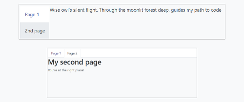
第一种方法是在组件的插槽中设置页面。
<Notebook orientation="'vertical'">
  <t t-set-slot="page_1" title="'Page 1'" isVisible="true">
    <h1>My First Page</h1>
    <p>It's time to build Owl components. Did you read the documentation?</p>
  </t>
  <t t-set-slot="page_2" title="'2nd page'" isVisible="true">
    <p>Wise owl's silent flight. Through the moonlit forest deep, guides my path to code</p>
  </t>
</Notebook>
另一种定义页面的方法是通过传递属性。如果某些页面共享相同的结构,这可能会很有用。首先为每个可能使用的页面模板创建一个组件。
import { Component, xml } from "@odoo/owl";
import { Notebook } from "@web/core/notebook/notebook";

class MyTemplateComponent extends Component {
  static template = xml`
    <h1 t-esc="props.title" />
    <p t-esc="props.text" />
  `;
}

class MyComponent extends Component {
  static template = xml`
    <Notebook defaultPage="'page_2'" pages="pages" />
  `;

  get pages() {
    return [
      {
        Component: MyTemplateComponent,
        title: "Page 1",
        props: {
          title: "My First Page",
          text: "This page is not visible",
        },
      },
      {
        Component: MyTemplateComponent,
        id: "page_2",
        title: "Page 2",
        props: {
          title: "My second page",
          text: "You're at the right place!",
        },
      },
    ]
  }
}
两个示例在此处展示:
分页器
位置
@web/core/pager/pager
描述
分页器是一个用于处理分页的小型组件。页面由 offset 和 limit (页面大小)定义。它显示当前页面和元素总数,例如 “9-12 / 20”。在前面的例子中,offset 为 8,limit 为 4,total 为 20。它有两个按钮(“上一页”和“下一页”)用于在页面之间导航。
注解
分页器可以在任何地方使用,但其主要用途是在控制面板中。请参阅 usePager 钩子以操作控制面板中的分页器。
<Pager offset="0" limit="80" total="50" onUpdate="doSomething" />
属性
名称 |
类型 |
描述 |
|---|---|---|
|
|
页面第一个元素的索引。它从 0 开始,但分页器显示的是 |
|
|
页面大小。 |
|
|
页面可以访问的元素总数。 |
|
|
当分页器修改页面时调用的函数。此函数可以是异步的,在函数执行期间分页器无法被编辑。 |
|
|
允许点击当前页面进行编辑(默认值为 |
|
|
在上一页按钮绑定快捷键 |
位置
@web/core/select_menu/select_menu
描述
当您希望实现比原生 select 元素更多功能时,可以使用此组件。您可以定义自己的选项模板,支持在选项之间进行搜索或将它们分组到子部分中。
注解
建议优先使用原生 HTML select 元素,因为它默认提供无障碍功能,并且在移动设备上具有更好的用户界面。此组件旨在用于更复杂的用例,以克服原生元素的限制。
属性
名称 |
类型 |
描述 |
|---|---|---|
|
|
可选。要在下拉菜单中显示的 |
|
|
可选。设置在 SelectMenu 组件根部的类名。 |
|
|
可选。包含要在下拉菜单中显示的 |
|
|
可选。启用多选功能。启用多选时,所选值会以 标签 的形式显示在 SelectMenu 输入框中。 |
|
|
可选。设置在切换按钮上的类名。 |
|
|
可选。是否允许取消已选项。 |
|
|
可选。是否在下拉菜单中显示搜索框。 |
|
|
可选。显示为搜索框占位符的文本。 |
|
|
可选。当前选中的值,可以是任意类型。 |
|
|
可选。选择某个选项时执行的回调函数。 |
choice 的结构如下:
value是选项的实际值。通常是一个技术字符串,但可以是任意类型。
label是与选项关联的显示文本。通常是一个更友好且经过翻译的字符串。
group 的结构如下:
choices是此组中要显示的choice列表。
label是与组关联的显示文本。这是一个显示在组顶部的字符串。
Example
在以下示例中,SelectMenu 将显示四个选项。其中一个选项显示在顶部,因为它没有与任何组关联,但其他选项则由其组标签分隔。
import { Component, xml } from "@odoo/owl";
import { SelectMenu } from "@web/core/select_menu/select_menu";

class MyComponent extends Component {
  static template = xml`
    <SelectMenu
      choices="choices"
      groups="groups"
      value="'value_2'"
    />
  `;

  get choices() {
    return [
        {
          value: "value_1",
          label: "First value"
        }
    ]
  }
  get groups() {
    return [
      {
          label: "Group A",
          choices: [
              {
                value: "value_2",
                label: "Second value"
              },
              {
                value: "value_3",
                label: "Third value"
              }
          ]
      },
      {
          label: "Group B",
          choices: [
              {
                value: "value_4",
                label: "Fourth value"
              }
          ]
      }
    ]
  }
}
您还可以使用适当的组件 slot 自定义切换器的外观并为选项设置自定义模板。
<SelectMenu
  choices="choices"
  groups="groups"
  value="'value_2'"
>
  Make a choice!
  <t t-set-slot="choice" t-slot-scope="choice">
    <span class="coolClass" t-esc="'👉 ' + choice.data.label + ' 👈'" />
  </t>
</SelectMenu>
当 SelectMenu 用于多选时,value 属性必须是一个包含所选选项值的 数组 。
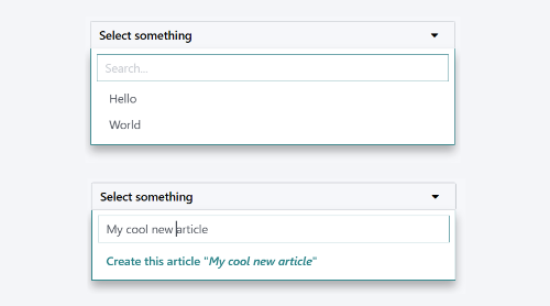
对于更高级的用例,您可以使用 bottomArea 插槽自定义下拉菜单的底部区域。在此处,我们选择显示一个按钮,并将搜索输入框中的值设置为对应的值。
<SelectMenu
    choices="choices"
>
    <span class="select_menu_test">Select something</span>
    <t t-set-slot="bottomArea" t-slot-scope="select">
        <div t-if="select.data.searchValue">
            <button class="btn text-primary" t-on-click="() => this.onCreate(select.data.searchValue)">
                Create this article "<i t-esc="select.data.searchValue" />"
            </button>
        </div>
    </t>
</SelectMenu>
位置
@web/core/tags_list/tags_list
描述
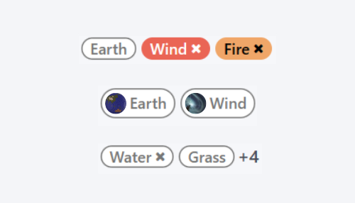
此组件可以以圆角药丸的形式显示标签列表。这些标签可以简单地列出一些值,也可以是可编辑的,允许移除项目。可以使用 itemsVisible 属性限制显示的项目数量。如果列表超出此限制,则会在最后一个标签旁边以圆形显示额外项目的数量。
属性
名称 |
类型 |
描述 |
|---|---|---|
|
|
可选。是否将标签显示为徽章。 |
|
|
可选。是否显示带有文本的标签。 |
|
|
可选。列表中可见标签的数量限制。 |
|
|
传递给组件的 |
tag 的结构如下:
colorIndex是一个可选的颜色 ID。
icon是一个可选图标,显示在文本之前。
id是标签的唯一标识符。
img是一个可选图像,显示在圆形中,位于文本之前。
onClick是一个可选回调函数,可以传递给元素。这允许父元素根据点击的标签处理任何功能。
onDelete是一个可选回调函数,可以传递给元素。这使得可以从标签列表中移除该项,并且必须由父元素处理。
text是与标签关联的显示文本(字符串)。
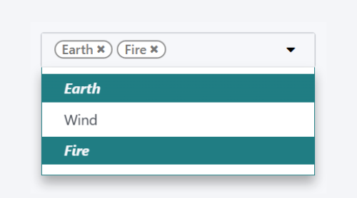
Example
在下一个示例中,使用 TagsList 组件显示多个标签。开发者需要从父组件处理当标签被按下或删除按钮被点击时会发生什么。
import { Component, xml } from "@odoo/owl";
import { TagsList } from "@web/core/tags_list/tags_list";

class Parent extends Component {
  static template = xml`<TagsList tags="tags" />`;
  static components = { TagsList };

  setup() {
    this.tags = [{
        id: "tag1",
        text: "Earth"
    }, {
        colorIndex: 1,
        id: "tag2",
        text: "Wind",
        onDelete: () => {...}
    }, {
        colorIndex: 2,
        id: "tag3",
        text: "Fire",
        onClick: () => {...},
        onDelete: () => {...}
    }];
  }
}
根据每个标签的属性,它们的外观和行为会有所不同。