构建块
构建块(也称为片段)是用户设计和布局页面的方式。它们是设计中的重要 XML 元素。
构建块分为两种类型:
结构块 :在视觉上用作“整行”,并分布在多个类别中(如 简介 、 列 、 内容 、 图片 、 人物 等)。
内部内容块 :用于其他构建块内部。
在本章结束时,您将能够 创建自定义片段 并将其添加到专用类别中。
文件结构
布局的文件结构如下。
views
├── snippets
│   └── options.xml
│   └── s_snippet_name.xml
样式的文件结构如下。
static
├── src
│   └── snippets
│       └── s_snippet_name
│           └── 000.js
│           └── 000.scss
│           └── 000.xml
│           └── options.js
演示页面
必须安装演示数据才能访问此页面:
https://your-database.com/website/demo/snippets
布局
用户可以使用 Website Builder 编辑片段。一些 Bootstrap 类非常重要,因为 它们会触发某些 Website Builder 选项 。
包装器
任何片段的标准主容器是一个 section 。任何 section 元素都可以像内容块一样被编辑、移动或复制。
<section class="s_snippet_name" data-name="..." data-snippet="...">
    <!-- Content -->
</section>
对于内部内容片段,可以使用任何其他 HTML 标签。
<div class="s_snippet_name" data-name="..." data-snippet="...">
    <!-- Content -->
</div>
属性 |
描述 |
|---|---|
类 |
此片段的唯一类名 |
data-name |
显示在右侧面板中作为片段的名称。如果未找到,则回退到 Block 。 |
data-snippet |
系统用来识别片段 |
系统会在拖放过程中根据模板名称自动添加 data-name 和 data-snippet 属性。
警告
当在主题页面中声明片段时,应特别添加这些属性。
警告
避免在一个 section 标签内添加另一个 section 标签:这将触发 Website Builder 的选项两次。您可以改用内部内容片段。
小技巧
使用标准片段编写静态页面内容时,有两种可能的方法:
- 使用 Website Builder 预构建自定义静态页面: 拖放片段,然后
将代码复制/粘贴到您的文件中并清理它。
- 直接编写所有代码: 但要注意与 Website Builder 的兼容性。它
需要某些类、名称、ID、数据等才能正常工作。一个好的做法是查找 Odoo 源文件中创建的标准代码片段。请注意,Website Builder 有时会在片段拖放到页面后为其添加类。
元素
我们可以通过使用特定的 CSS 类来启用或禁用一系列“功能”。
尺寸调整
任何直接从 .row 元素派生的大 Bootstrap 列(遵循 Bootstrap 结构)都会被 Website Builder 触发以使其可调整大小。
.row > .col-lg-*
为列和 <section> 添加内边距。
class="pt80 pb80"
注解
pb* 和 pt* 是用于控制句柄的 Odoo 类。它们的值按 8 的倍数 递增,直到 最大值 256 (0、8、16、24、32、40、48,…)。
启用列选择器。
<div class="container s_allow_columns">
禁用列数量选项。
<div class="row s_nb_column_fixed">
禁用所有子列的尺寸选项。
<div class="row s_col_no_resize">
禁用某一特定列的尺寸选项。
<div class="col-lg-* s_col_no_resize">
颜色
基于调色板为列和 <section> 添加背景。
class="o_cc o_cc*"
禁用所有列的背景颜色选项。
<div class="row s_col_no_bgcolor">
禁用某一特定列的背景颜色选项。
<div class="col-lg-* s_col_no_bgcolor">
添加一个不透明度为 50% 的黑色滤镜。
<section>
    <div class="o_we_bg_filter bg-black-50"/>
    <div class="container">
        <!-- Content -->
    </div>
</section>
添加一个不透明度为 85% 的白色滤镜。
<section>
    <div class="o_we_bg_filter bg-white-85"/>
    <div class="container">
        <!-- Content -->
    </div>
</section>
添加自定义颜色滤镜。
<section>
    <div class="o_we_bg_filter" style="background-color: rgba(39, 110, 114, 0.54) !important;"/>
    <div class="container">
        <!-- Content -->
    </div>
</section>
添加自定义渐变滤镜。
<section>
    <div class="o_we_bg_filter" style="background-image: linear-gradient(135deg, rgba(255, 204, 51, 0.5) 0%, rgba(226, 51, 255, 0.5) 100%) !important;"/>
    <div class="container">
        <!-- Content -->
    </div>
</section>
功能
不可编辑区域
使元素不可编辑。
<div class="o_not_editable">
使元素不可移除。
<div class="oe_unremovable">
背景
添加背景图片并使其居中。
<div class="oe_img_bg o_bg_img_center" style="background-image: url('...')">
添加视差效果。
<section class="parallax s_parallax_is_fixed s_parallax_no_overflow_hidden" data-scroll-background-ratio="1">
    <span class="s_parallax_bg oe_img_bg o_bg_img_center" style="background-image: url('...'); background-position: 50% 75%;"/>
    <div class="container">
        <!-- Content -->
    </div>
</section>
注解
可以在部分上设置视频背景。请参阅本文档的 “媒体” 章节。
文本高亮
文本高亮是 SVG 文件,可以应用到特定的单词或短语上以突出显示它们。文本高亮提供了颜色和粗细的自定义选项。

<h2>
   Title with
   <span class="o_text_highlight o_text_highlight_fill" style="--text-highlight-width: 10px !important; --text-highlight-color: #FFFF00;">
      <span class="o_text_highlight_item">
         highlighted text
         <svg fill="none" class="o_text_highlight_svg o_content_no_merge position-absolute overflow-visible top-0 start-0 w-100 h-100 pe-none">
            <!-- SVG path -->
         </svg>
      </span>
   </span>
</h2>
CSS 自定义属性 |
描述 |
|---|---|
|
SVG 边框的粗细 |
|
SVG 对象的颜色 |
网格布局
网格布局是 CSS 中一个强大且灵活的布局系统,使用户能够轻松设计复杂的构建块布局。
使用
通过在 row 上添加 o_grid_mode CSS 类来启用网格布局。网格中的行数由 data-row-count 属性定义。网格始终包含 12 列。网格间距(或称沟槽)由 style 属性指定,用于确定行与列之间的间隙。
<div class="row o_grid_mode" data-row-count="13" style="gap: 20px 10px">
   <!-- Content -->
</div>
网格中的项目
使用 o_grid_item 类向网格中添加项目。如果网格项目包含图像,则使用 o_grid_item_image 类。
<div class="row o_grid_mode" data-row-count="13">
   <div class="o_grid_item g-height-* g-col-lg-*" style="grid-area: 2 / 1 / 7 / 8; z-index: 3;">
      <!-- Content -->
   </div>
   <div class="o_grid_item o_grid_item_image g-height-* g-col-lg-*" style="grid-area: 1 / 6 / 9 / 13; z-index: 2;">
      <img src="..." alt="..." >
   </div>
</div>
网格项目的尺寸和位置由网格区域(grid-area)定义,可以通过 style 属性显式设置,并结合 z-index 使用。
g-height-* 和 g-col-lg-* 类由 Website Builder 生成,用于编辑目的。
网格项目内边距
<div class="row o_grid_mode" data-row-count="13" style="gap: 20px 10px;">
   <div class="o_grid_item g-height-* g-col-lg-*" style="--grid-item-padding-y: 20px; --grid-item-padding-x: 15px; grid-area: 2 / 1 / 7 / 8; z-index: 3;">
      <!-- Content -->
   </div>
</div>
CSS 自定义属性 |
描述 |
|---|---|
|
垂直内边距(Y 轴) |
|
水平内边距(X 轴) |
兼容性系统
- 当片段具有
data-vcss、data-vjs和/或data-vxml属性时,意味着它是更新后的 版本,而不是原始版本。
<section class="s_snippet_name" data-vcss="001" data-vxml="001" data-js="001">
    <!-- Content -->
</section>
这些数据属性指示系统为该片段加载哪个文件版本(例如, 001.js 、 002.scss )。
自定义片段
一些更具体的需求需要创建自定义片段。以下是创建自定义片段的方法:
模板
首先创建片段模板,然后将其添加到列表中并通过 Website Builder 提供使用。
1. 声明
首先,创建自定义片段的模板:
/website_airproof/views/snippets/s_airproof_snippet.xml¶<?xml version="1.0" encoding="utf-8"?>
<odoo>
<template id="s_airproof_snippet" name="...">
<section class="s_airproof_snippet">
<!-- Content -->
</section>
</template>
</odoo>
警告
在主题页面上声明片段时,必须指定 data-name 和 data-snippet 属性。否则,Website Builder 将无法识别该片段,并且在数据库升级时可能会出现问题。此外,请记住,name 属性会显示为选项面板中 块 部分中自定义片段的名称。
小技巧
尽可能使用 Bootstrap 原生类。
为所有自定义类添加前缀。
使用下划线小写命名法为类命名,例如
.x_nav、.x_nav_item。避免在
section中使用 ID 属性,因为片段的多个实例可能会出现在页面的不同位置(ID 属性在页面中必须唯一)。
将自定义片段添加到标准片段列表中,这样用户可以直接从编辑面板拖放它到页面上。
2. 创建分组
在列表顶部添加一个组(可以根据需要放在此列表中的任意位置)。
/website_airproof/views/snippets/options.xml¶<template id="snippets" inherit_id="website.snippets" name="Airproof - Snippets">
<!-- Create the group -->
<xpath expr="//snippets[@id='snippet_groups']/*[1]" position="before">
<t snippet-group="airproof" t-snippet="website.s_snippet_group" string="Airproof" t-thumbnail="/website_airproof/static/src/img/wbuilder/s_airproof_group_thumbnail.svg"/>
</xpath>
</template>
属性 |
描述 |
|---|---|
片段分组 |
分组的 ID |
t-snippet |
继承的模板 ID |
字符串 |
显示给用户的分组名称 |
t-thumbnail |
分组缩略图的路径 |
3. 添加片段
然后将自定义片段添加到包含同一级别所有现有片段的 <snippets id="snippet_structure"> 中。Website Builder 将通过读取 <t t-snippet=""> 上的 group 属性自动将它们分类。
/website_airproof/views/snippets/options.xml¶<template id="snippets" inherit_id="website.snippets" name="Airproof - Snippets">
<!-- Create the group -->
<xpath expr="//snippets[@id='snippet_groups']/*[1]" position="before">
<t snippet-group="airproof" t-snippet="website.s_snippet_group" string="Airproof" t-thumbnail="/website_airproof/static/src/img/wbuilder/s_airproof_group_thumbnail.svg"/>
</xpath>
<!-- Add the custom snippet to the group -->
<xpath expr="//snippets[@id='snippet_structure']/*[1]" position="before">
<t t-snippet="website_airproof.s_airproof_snippet" string="Custom snippet" group="airproof">
<keywords>Snippet</keywords>
</t>
</xpath>
</template>
属性 |
描述 |
|---|---|
t-snippet |
要使用的片段模板 |
分组 |
添加片段的分组。 |
<关键词> |
用户在片段面板的搜索字段中输入的关键词 |
内部内容片段
要使自定义片段出现在 内部内容 列表中,请将其添加到 snippet_content 中:
/website_airproof/views/snippets/options.xml¶<template id="snippets" inherit_id="website.snippets" name="Airproof - Snippets">
<!-- Add the custom snippet to the group -->
<xpath expr="//snippets[@id='snippet_content']/*[1]" position="before">
<t t-snippet="website_airproof.s_airproof_snippet" string="Custom snippet" t-thumbnail="/website_airproof/static/src/img/wbuilder/s_airproof_snippet.svg" />
</xpath>
</template>
重要
不要忘记添加
t-thumbnail并移除group属性,因为这种构建块会直接出现在 Website Builder 的右侧选项面板中。不要忘记 将片段添加到所有可用的“内部内容”片段列表中 。
选项
选项允许用户使用 Website Builder 编辑片段的外观或行为。您可以轻松创建片段选项,并自动将它们添加到 Website Builder 中。
参见
模板
有许多命令可以设置自定义片段的选项。这些选项可以创建在 /website_airproof/views/snippets/s_airproof_snippet.xml 中。
/website_airproof/views/snippets/s_airproof_snippet.xml¶<template id="s_airproof_snippet_options" inherit_id="website.snippet_options" name="Airproof - Snippets Options">
<xpath expr="." position="inside">
<!-- Options -->
</xpath>
</template>
然后插入不同的可用选项:
/website_airproof/views/snippets/s_airproof_snippet.xml¶<template id="s_airproof_snippet_options" inherit_id="website.snippet_options" name="Airproof - Snippets Options">
<xpath expr="." position="inside">
<div data-selector=".s_airproof_snippet">
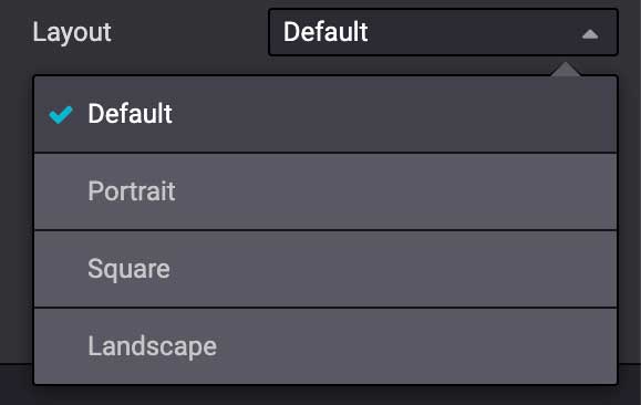
<we-select string="Layout">
<we-button data-select-class="">Default</we-button>
<we-button data-select-class="s_airproof_snippet_portrait">Portrait</we-button>
<we-button data-select-class="s_airproof_snippet_square">Square</we-button>
<we-button data-select-class="s_airproof_snippet_landscape">Landscape</we-button>
</we-select>
<we-title>Space</we-title>
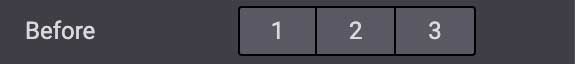
<we-button-group string="Before">
<we-button data-select-class="mt-0">1</we-button>
<we-button data-select-class="mt-3">2</we-button>
<we-button data-select-class="mt-5">3</we-button>
</we-button-group>
</div>
</xpath>
</template>
内部内容
通过扩展包含所有引用现有内部内容构建块的 CSS 选择器的 so_content_addition_selector 变量,使自定义片段成为“内部内容”(可拖放到其他构建块中):
/website_airproof/views/snippets/options.xml¶<template id="snippet_options" inherit_id="website.snippet_options" name="Airproof - Snippets Options">
<xpath expr="//t[@t-set='so_content_addition_selector']" position="after">
<t t-set="so_content_addition_selector"
t-value="so_content_addition_selector + ', .s_airproof_snippet'" />
</xpath>
</template>
绑定
这些选项使用 CSS 选择器(类、XML 标签、ID 等)。
data-selector
选项被包裹在组中。组可以具有定义包含的选项如何与用户界面交互的属性。
data-selector 将组中包含的所有选项绑定到与选择器值匹配的特定元素(CSS 类、ID 等)。当匹配的选择器被选中时,选项将出现。
<div data-selector="section, h1, .custom_class, #custom_id">
It can be used in combination with other attributes like data-target, data-exclude or
data-apply-to.
data-target
data-target="" 允许将选项应用于 data-selector="" 的子元素。
<div
   data-selector=".s_airproof_snippet"
   data-target=".row">
data-exclude
data-exclude="" 允许从规则中排除某些特定的选择器。
<ul> 标签(不带 .navbar-nav 类),则该选项会出现。¶<div
data-selector="ul"
data-exclude=".navbar-nav">
data-drop-in
data-drop-in 定义了片段可以拖放到的元素列表。
<div data-selector=".s_airproof_snippet" data-drop-in=".x_custom_location">
data-drop-near
data-drop-near 定义了片段可以拖放到旁边的元素列表。
<div data-selector=".s_airproof_snippet_card" data-drop-near=".card">
data-js
data-js 绑定自定义的 JavaScript 方法。
<div data-selector=".s_airproof_snippet" data-js="CustomMethodName">
布局与字段
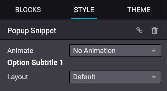
<we-title>
在选项之间添加标题以对它们进行分类。
<we-title>Option subtitle 1</we-title>
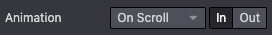
<we-row>
创建一行,其中元素彼此相邻显示。
<we-row string="My option">
   <we-select>...</we-select>
   <we-button-group>...</we-button-group>
</we-row>
这种情况的完美示例是 动画 行:
<we-button>
此标签用于 <we-select> 和 <we-button-group> 内部。
<we-button-group string="Before">
   <we-button data-select-class="mt-0">1</we-button>
   <we-button data-select-class="mt-3">2</we-button>
   <we-button data-select-class="mt-5">3</we-button>
</we-button-group>
添加 data-select-class="" 以指示在选择此项时为目标元素添加哪个类。像任何 XML 节点一样,添加其他属性可以改进样式和/或用户体验。
<we-button
   class="fa fa-fw fa-angle-double-right"
   title="Move to last"
   data-position="last" />

<we-select>
将选项格式化为下拉列表。添加 string="" 以指示字段名称。
<we-select string="Layout">...</we-select>
<we-button-group>
将选项格式化为彼此相邻的按钮。
<we-button-group string="Before">...</we-button-group>
<we-checkbox>
将选项格式化为开关切换。
<we-checkbox
   string="Tooltip"
   data-select-class="s_airproof_snippet_tooltip" />

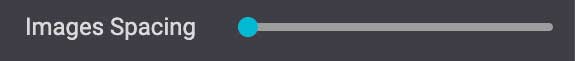
<we-range>
将选项格式化为滑块。
<we-range
   string="Images Spacing"
   data-select-class="o_spc-none|o_spc-small|o_spc-medium|o_spc-big" />
范围的每个步骤由 | 分隔。在这里,每个类名对应一个步骤。
<we-input>
将选项格式化为文本字段。
data-unit, data-save-unit and data-step are optional¶<we-input
string="Speed"
data-unit="s"
data-save-unit="ms"
data-step="0.1" />
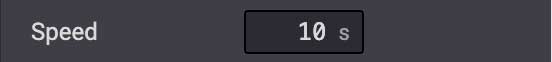
<we-input> 带有一些在特定情况下特别有用的可选属性:
属性 |
描述 |
|---|---|
|
显示预期的计量单位。 |
|
设置用户输入的值被转换并保存的计量单位。 |
|
设置字段可以递增的数值。 |
<we-colorpicker>
将选项格式化为可选择的颜色/渐变。
<we-colorpicker
   string="Color filter"
   data-select-style="true"
   data-css-property="background-color"
   data-color-prefix="bg-"
   data-apply-to=".s_map_color_filter" />

属性 |
描述 |
|---|---|
|
引用 |
|
定义颜色选择器所针对的 CSS 属性。 |
|
定义返回的 CSS 类的前缀。 |
|
设置应用颜色的元素。 |
方法
除了允许选择、定位或排除元素的 绑定选项 之外,选项字段还有几个有用的数据属性,引用标准的 JavaScript 方法。
例如,data-select-class 引用了名为 selectClass 的 JavaScript 方法。
内置方法
选择
有几种内置方法可用。可以通过在 XML 模板中直接使用相关的数据属性来调用它们。
数据属性 |
描述 |
|---|---|
|
允许在选项类集中选择一个且仅一个类,并将其设置到关联的片段上。 |
|
允许选择一个值并将其作为属性设置到关联的片段上。属性名称由 |
|
允许选择一个值并将其作为属性设置到关联的片段上。属性名称由 |
|
允许选择一个值并将其作为 CSS 样式设置到关联的片段上。属性名称由 |
|
启用颜色调色板的选择。仅适用于 |
事件
还有一些内置方法直接与 Website Builder 监听的事件相关联:
名称 |
描述 |
|---|---|
开始 |
当发布者在编辑会话中首次选择片段或将片段拖放到页面上时触发。 |
销毁 |
在发布者保存页面后触发。 |
获得焦点 |
每当用户选择片段或将片段拖放到页面上时触发。 |
失去焦点 |
当片段失去焦点时触发。 |
克隆 |
在片段被复制后立即触发。 |
移除 |
在片段被移除之前触发。 |
构建完成 |
在片段被拖放到放置区域后立即触发。当此事件触发时,内容已经插入到页面中。 |
清理以保存 |
在发布者保存页面之前触发。 |
自定义方法
要创建自定义 JavaScript 方法,必须在选项组和自定义方法之间建立链接。为此,需要创建一个 JavaScript 类,并通过 data-js 在 XML 模板中调用它。
为您的选项组添加 data-js 属性:
<template id="s_airproof_snippet_options" inherit_id="website.snippet_options" name="Airproof - Snippets Options">
   <xpath expr="." position="inside">
      <div data-selector=".s_airproof_snippet" data-js="airproofSnippet">
         // Options
      </div>
   </xpath>
</template>
然后,可以在 JavaScript 文件中创建该类:
/website_airproof/static/src/s_airproof_snippet/options.js¶/** @odoo-module */
import options from 'web_editor.snippets.options';
const AirproofSnippet = options.Class.extend({
// Built-in method example
start: function() {
//...
}
// Custom method example
customMethodName: function() {
//...
}
});
options.registry.AirproofSnippet = AirproofSnippet;
export default AirproofSnippet;
最后,可以通过 XML 模板调用自定义方法:
<template id="s_airproof_snippet_options" inherit_id="website.snippet_options" name="Airproof - Snippets Options">
   <xpath expr="." position="inside">
      <div data-selector=".s_airproof_snippet" data-js="airproofSnippet">
         <we-checkbox data-custom-method-name="" />
      </div>
   </xpath>
</template>
动态内容模板
默认情况下,动态内容块在 Website Builder 中有一组可用的模板。通过使用与模板 ID 属性相同的命名约定,也可以自动将自定义模板添加到列表中。
调用模板
选定的动态片段基于 data-template-key 和自定义 CSS 类,将占位符 <div class="dynamic_snippet_template"/> 替换为正确的模板:
<section
   data-snippet="s_blog_posts"
   data-name="Blog Posts"
   class="s_blog_post_airproof s_dynamic_snippet_blog_posts s_blog_posts_effect_marley s_dynamic pb32 o_cc o_cc2 o_dynamic_empty"
   data-template-key="website_airproof.dynamic_filter_template_blog_post_airproof"
   data-filter-by-blog-id="-1"
   data-number-of-records="3"
   data-number-of-elements="3"
>
   <div class="container o_not_editable">
      <div class="css_non_editable_mode_hidden">
            <div class="missing_option_warning alert alert-info rounded-0 fade show d-none d-print-none">
               Your Dynamic Snippet will be displayed here... This message is displayed because you did not provided both a filter and a template to use.<br/>
            </div>
      </div>
      <div class="dynamic_snippet_template"/>
   </div>
</section>
示例
/website_airproof/views/snippets/options.xml¶<template id="dynamic_filter_template_blog_post_airproof" name="...">
<div t-foreach="records" t-as="data" class="s_blog_posts_post">
<t t-set="record" t-value="data['_record']"/>
<!-- Content -->
</div>
</template>
属性 |
描述 |
|---|---|
ID |
模板的 ID。必须以 |
名称 |
模板的可读名称 |
/website_airproof/views/snippets/options.xml¶<template id="dynamic_filter_template_product_product_airproof" name="...">
<t t-foreach="records" t-as="data" data-number-of-elements="4" data-number-of-elements-sm="1" data-number-of-elements-fetch="8">
<t t-set="record" t-value="data['_record']"/>
<!-- Content -->
</t>
</template>
属性 |
描述 |
|---|---|
ID |
模板的 ID。必须以 |
名称 |
模板的可读名称 |
每张幻灯片显示的产品数量(桌面端) |
桌面端每张幻灯片显示的产品数量 |
每张幻灯片显示的产品数量(移动端) |
移动端每张幻灯片显示的产品数量 |
获取的产品总数 |
获取的产品总数 |
/website_airproof/views/snippets/options.xml¶<template id="dynamic_filter_template_event_event_airproof" name="...">
<div t-foreach="records" t-as="data" class="s_events_event">
<t t-set="record" t-value="data['_record']._set_tz_context()"/>
<!-- Content -->
</div>
</template>
属性 |
描述 |
|---|---|
ID |
模板的 ID。必须以 |
名称 |
模板的可读名称 |